
Welcome!
I am a seasoned graphic and visual designer bringing warmth, intention, and an authentic creative vision to every project.
BRAND IDENTITY
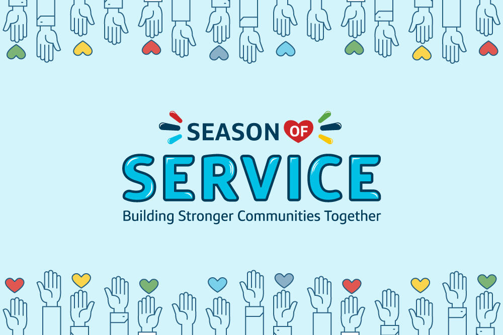
Volunteer Program
A logo and brand identity design for a new internal community service initiative.
BRAND IDENTITY
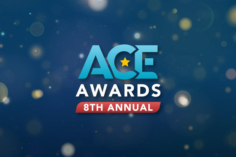
Awards Program
A refreshed identity for an associate awards program that provides a premium experience.
Brand Identity
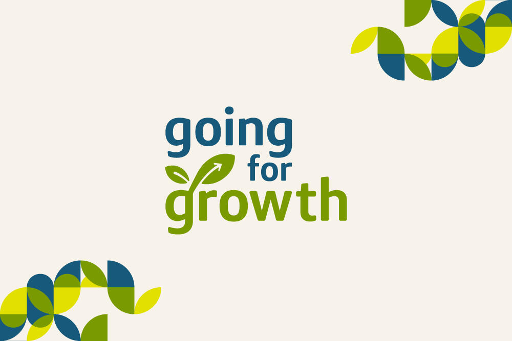
Banking Podcast
A new logo and identity for a Commercial Banking podcast that highlights wins and important lessons.
Campaign Graphics
Team Cheers
A look and feel, for a new initiative, to be applied across all digital communications and printed materials.

UX/UI & VISUAL DESIGN
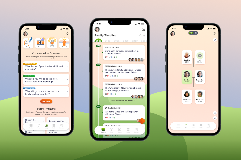
MVP Concept App
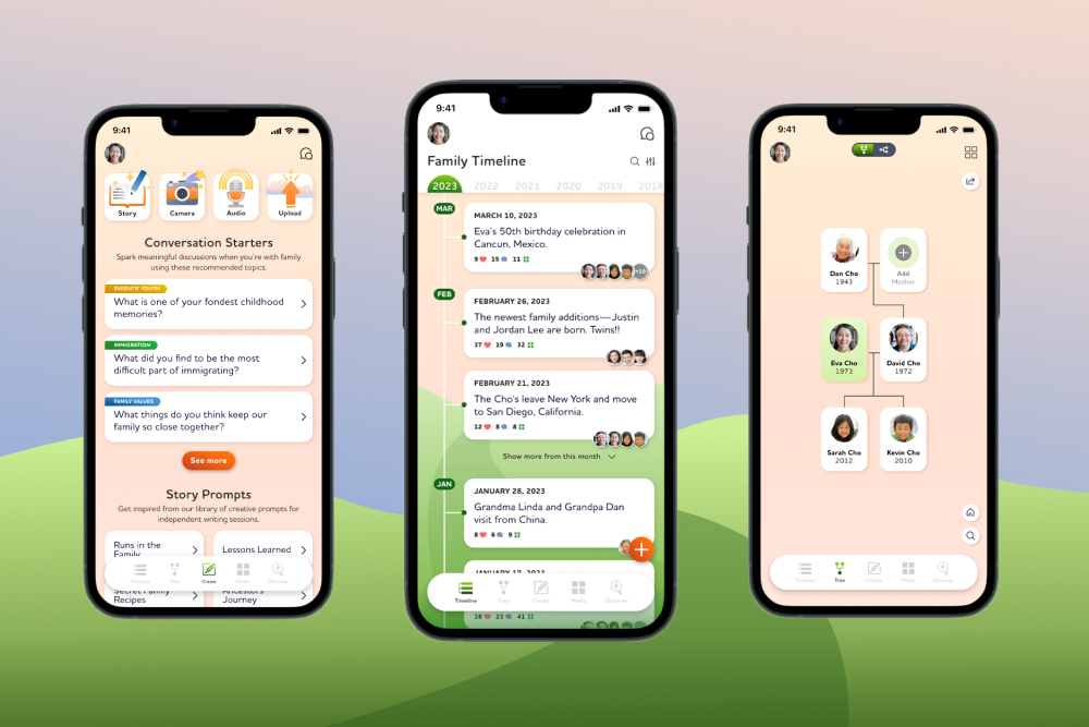
An end-to-end app concept designed to help users document their family history in a more fun, organized, and approachable way.
UX/UI & VISUAL DESIGN
Concept Website
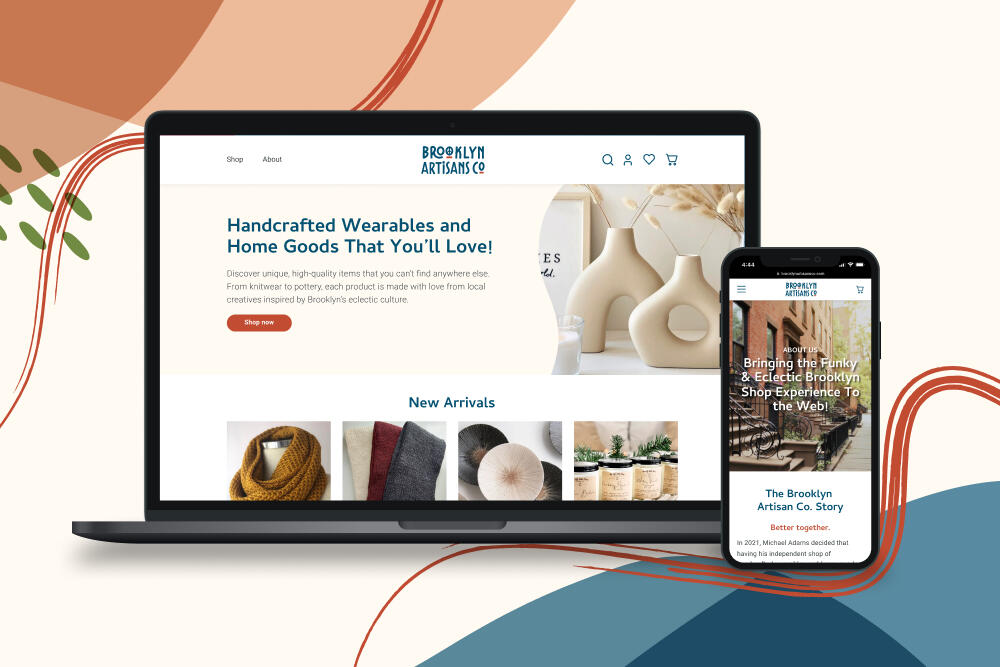
A responsive e-commerce website created for a Brooklyn-based small business that is ready to expand their online presence beyond an Etsy store.
Hi! I'm Julian.
Unlike most professionals in my field, my journey started on a path heading straight toward a career in medicine. But despite my admiration for the sciences, my passion for design and creativity moved front and center.
I am a Graphic Designer driven to create memorable digital and visual experiences by telling stories that influence, inspire, and inform.My educational background in both Graphic Design and Integrative Neuroscience has played an important role in my ability to design with empathy and intention. A fruitful 10+ years as a graphic designer in both agency and in-house environments has allowed me to grow into a multidisciplinary problem solver.In my free time, I enjoy traveling, trying out new restaurants and food, and spending time with my loved ones. I am continuously working on my craft, and I'm always eager to tackle any creative challenge.

Experience
Work History
Apostol Creative LLC
Self-employed
Nov 2025 - PresentCapital One
Principal Multimedia Designer
Apr 2019 - Nov 2025Flywheel Partners
Senior Graphic Designer
Sep 2016 - Mar 2019TPG Architecture
Freelance Graphic Designer
Oct 2015 - Jan 2016
Education & Certificates
B.A. in Graphic Design & B.S. in Integrative Neuroscience
SUNY Binghamton
2010 - 2014User Experience Design Certificate
Designlab
2023Principles of Animation Certificate
School of Motion
2021
Hobbies and Interests
Pottery
Pottery has truly become a safehaven for me. I easily get lost in the craft—I love getting my hands dirty and trying to make something out of just a ball of clay. It reminds me to let go of perfection, adapt to unpredictability, and appreciate the process.
Plants
Although I don't have any pets to take care of yet, I do have 25+ plants! My interest in learning about and collecting plants peaked during the pandemic and now it's almost impossible for me to leave IKEA without a new green friend. 😅
Interested in working together?
Let me know the best way to reach you and a few details of your project.
PLATFORMS
Multi-channel (Internal website, event branding, emails, social posts, print materials, etc.)
Role
Graphic Designer
Project Overview
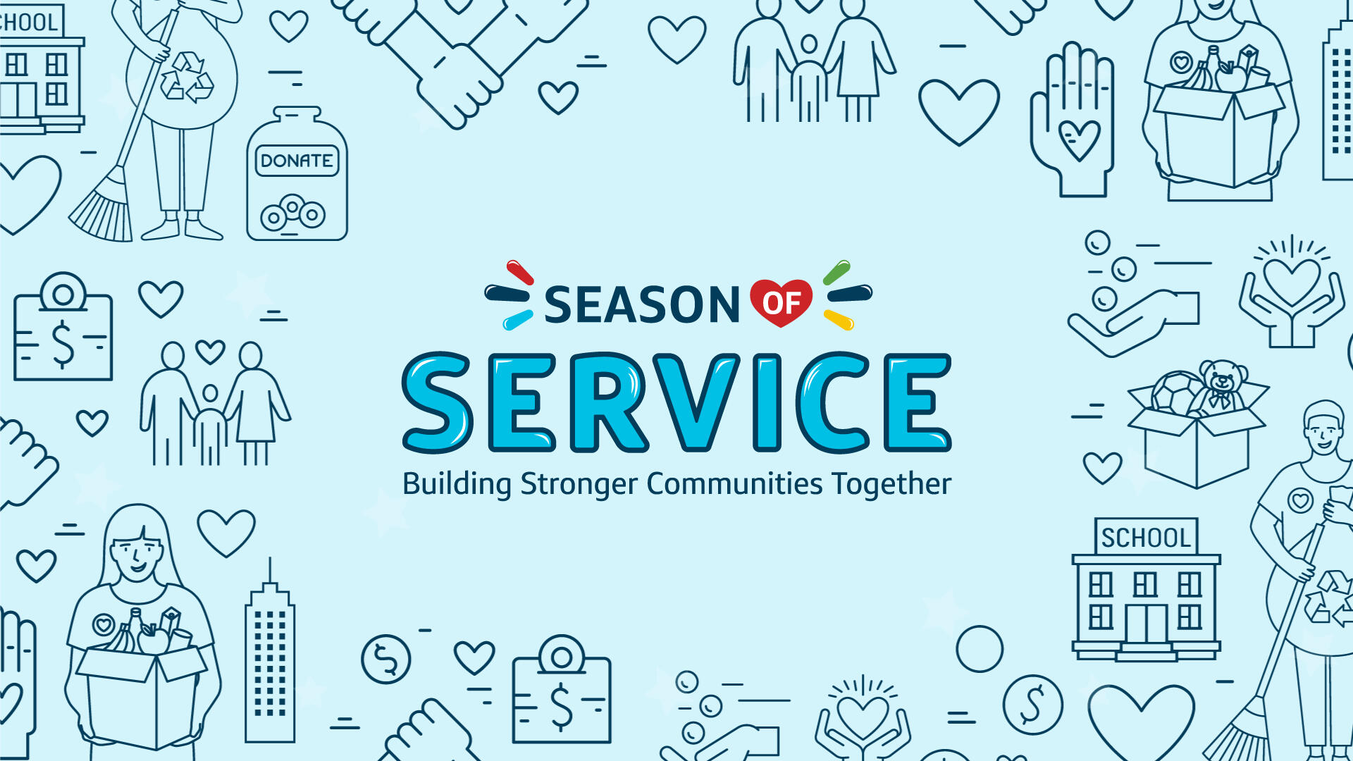
What is Season of Service?
Season of Service is meant to bring associates from different parts of the company together in order to achieve great things while supporting communities in need—through crucial fundraising and volunteerism.
The Challenge
How can we craft a visual system that informs and excites associates about volunteerism?
Problem
Community service advocates in the company were developing Season of Service and needed a brand identity that could be utilized for its debut campaign and annually afterwards.
Goal
Create a brand package that energizes associates, enables captivating storytelling, and celebrates positive impact for communities in need.
EMPATHIZE & IDEATE
Exploring different ways to convey compassion and positive energy
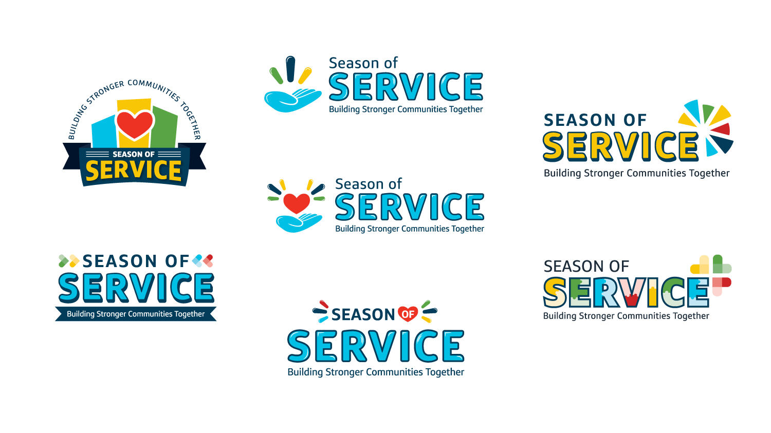
Vibrant colors and "bursts"
After exploring many variations of symbols that represent compassion, I focused heavily on hearts. To represent energy, I used simple design elements that look like bursts. Utilizing the brand colors, I chose to use them to make the logo look joyful and bright.
DESIGN IDENTITY
Implementing the new visual system throughout the campaign materials
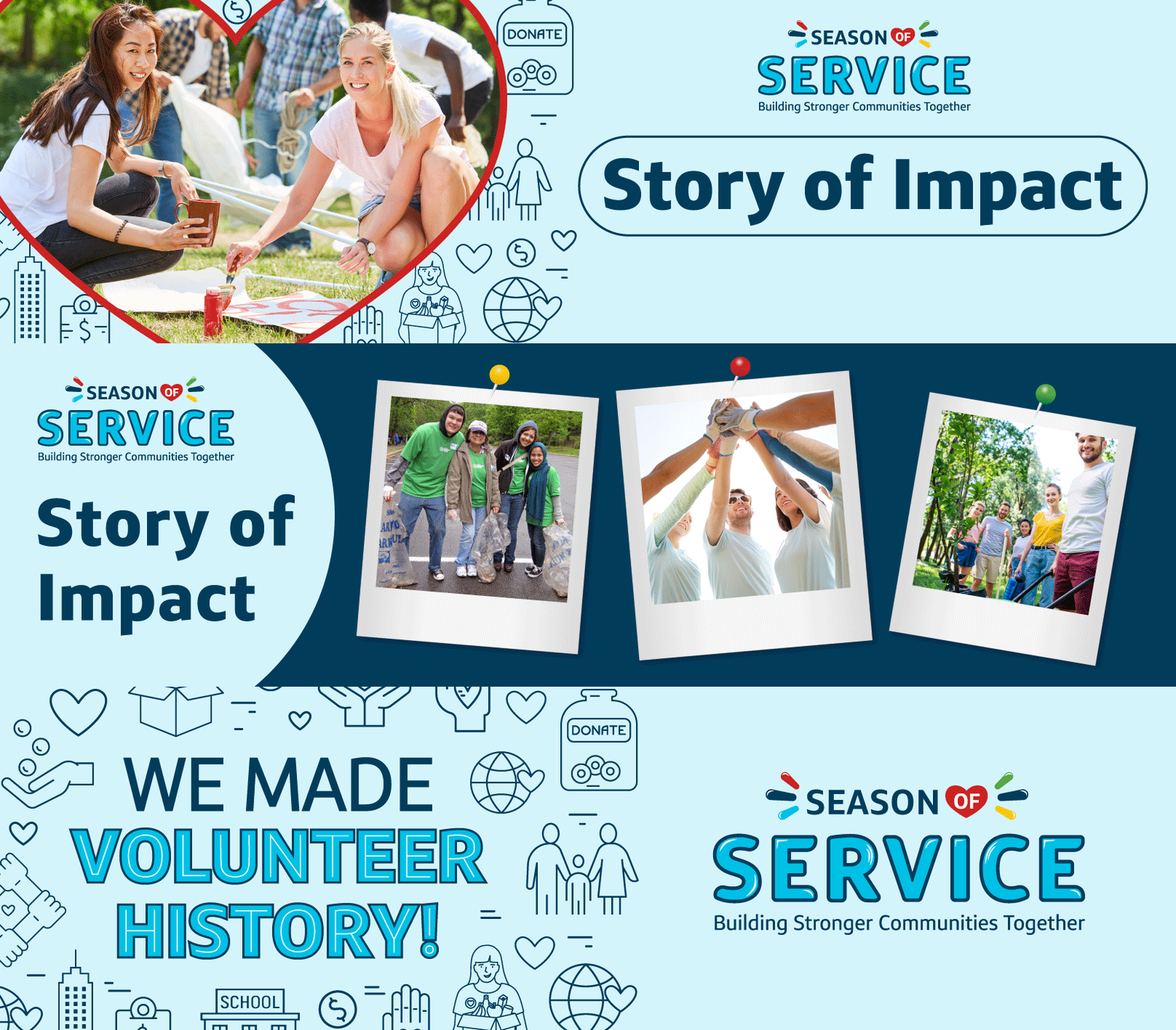
I tied all communications and branded materials together in order to maintain a cohesive visual experience. Since it was a newly developed program, brand consistency was imperative to building a positive reputation.Deliverables included: Poster boards, digital displays, social posts, emails, etc.


Results
A successful campaign with a positive impact
The campaign for the first year of Season of Service was so successful that the department made volunteer history by the end of the program. Through seamless communications and storytelling, the associate experience was positively influenced so that people not only felt good about volunteering but also were open to sharing their experiences through social channels.
View more projects
Brand Identity
Awards Program
A refreshed identity for an associate awards program that provides a premium experience.
Brand Identity
Banking Podcast
A new logo and identity for a Commercial Banking podcast that highlights wins and important lessons.
PLATFORMS
Multi-channel (Internal website, event branding, emails, social posts, print materials, etc.)
Role
Graphic Designer
Project Overview
What are the ACE Awards?
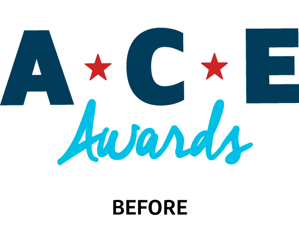
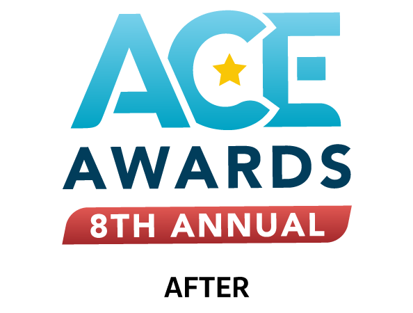
The ACE Awards are an annual associate recognition program that awards high-achieving and ambitious individuals. The program provides a premium off-site experience to the winners. The project's needs focused mainly on the redesign of the logo and a refreshed visual identity system that gave it a more elevated look and feel. The system was to be used across all associate touchpoints—in all communications and branded materials.

The Challenge
How can we elevate the existing logo and identity to something more suitable to the experience provided by the program?
Problem
The current branding didn't properly live up to the "premium-level" experience the new program leaders were hoping to achieve.
Goal
Create a new version of the branding that both enhances the associate perception of the program and matches the premium-level of experience for the off-site event. The stakeholders initially wanted something completely new.
EMPATHIZE & IDEATE
Exploring different ways to transform the visual storytelling
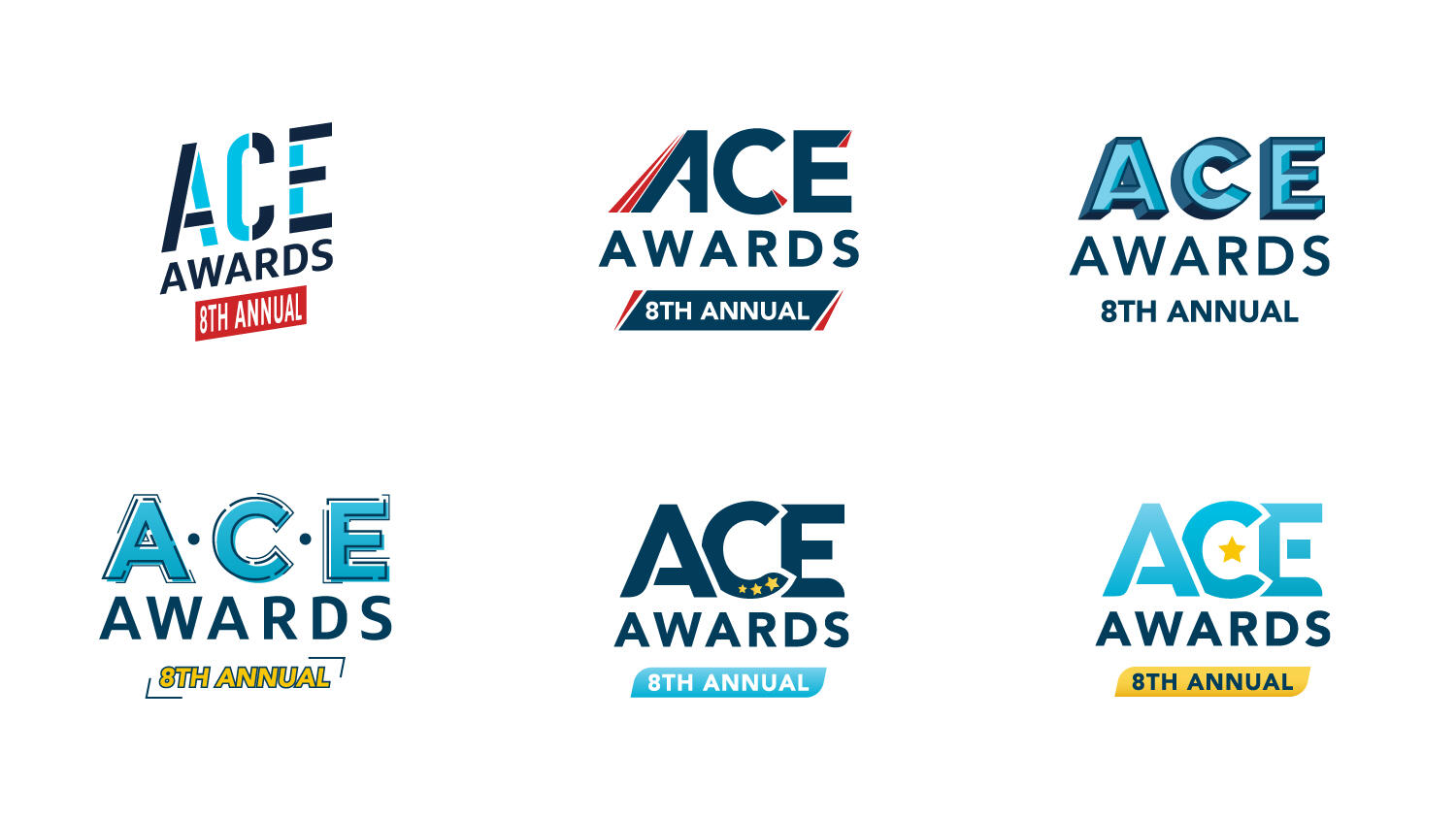
Brand new vs. refreshed
Although the stakeholders requested that the branding move into a direction they've never seen before, I saw value in exploring iterations that gave some semblance to the original design. Since this program has an existing reputation throughout the company, it would be more strategic to maintain a visual connection to the previous logo.
DESIGN IDENTITY
Implementing the refreshed visual system into a suite of deliverables
Through several discussions and presentations, the stakeholders decided on the logo that held some visual connection to the original. I then built out a system to complement the final logo option—using colors and design elements that emphasized the modern and simple aesthetic of the logo.Deliverables included: Name badges, welcome kit + card, Zoom backgrounds for virtual attendees, and other event print materials.


Results
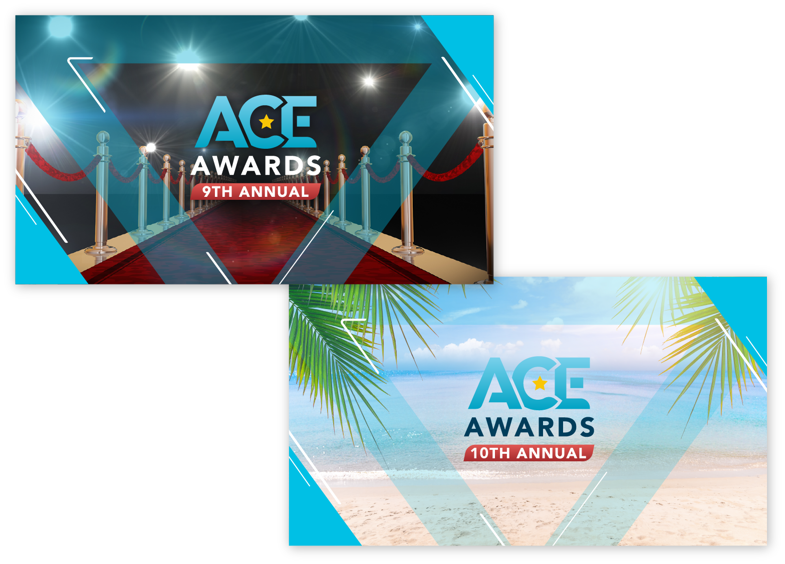
A flexible design system to incorporate new themes each year
The new identity proved to be adaptable enough to include changing visuals that match the theme of the annual event. Below are examples of how the system can be utilized to alter the program storyline each year.
View more projects
Brand Identity
Banking Podcast
A new logo and identity for a Commercial Banking podcast that highlights wins and important lessons.

Campaign Graphics
Associate Appreciation
A look and feel, for a new initiative, to be applied across all digital communications and printed materials.
PLATFORMS
Multi-channel (Internal website, event branding, emails, social posts, print materials, etc.)
Role
Graphic Designer
Project Overview
What is the Going for Growth Podcast?
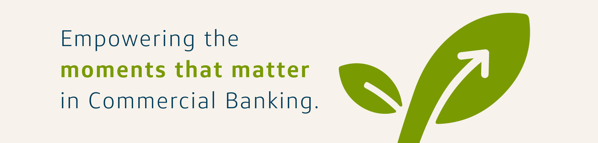
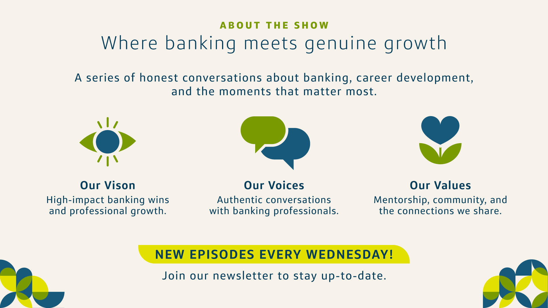
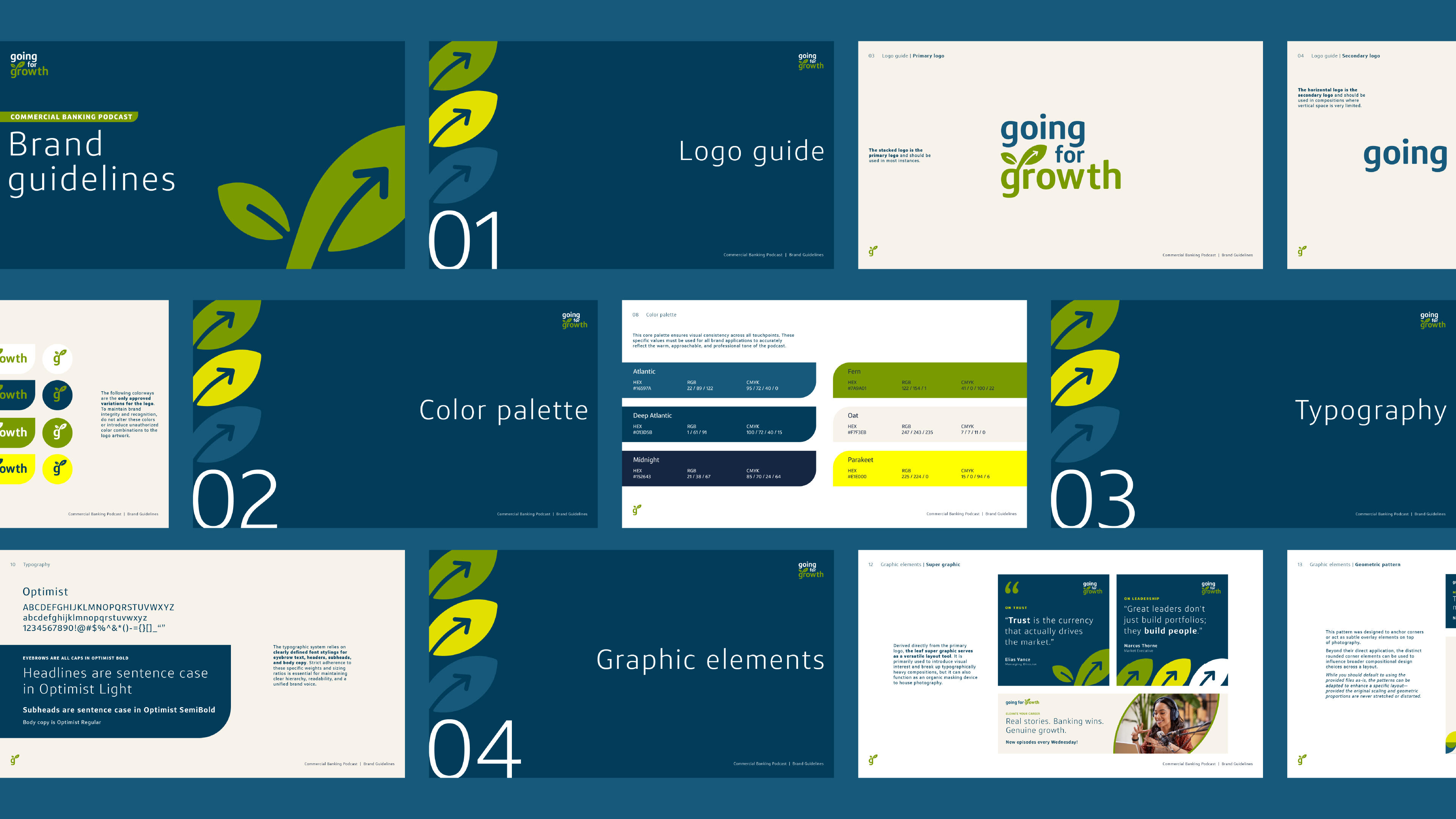
Going for Growth is an internal podcast platform designed to celebrate the moments that matter across the commercial bank. The show highlights major business wins while also exploring the personal and professional growth of the banking professionals who make them happen.
The Challenge
Can a banking podcast feel both professional and deeply human?
Problem
Corporate banking communications often rely on cold aesthetics. This rigidity makes it difficult to engage associates in authentic conversations about personal and professional growth.
Goal
Create a warm, inviting visual identity that breaks free from expected corporate constraints to drive active listenership. The branding must visually balance tangible financial success with organic personal development.
EMPATHIZE & IDEATE
Visualizing authentic connection
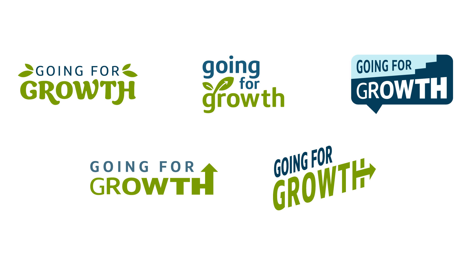
During the initial exploration, I developed multiple logo concepts for team reviews, testing different visual metaphors to capture the idea of "growth" and "moments that matter." Early iterations explored:
The Leaf & Arrow: A hybrid approach testing the balance between organic personal development and upward business momentum.
Speech Bubbles: Focusing on dialogue, human connection, and the podcast medium itself.
Upward Steps: Highlighting structural career progression, corporate milestones, and tangible banking wins.
DESIGN IDENTITY
Bringing the Brand to Life
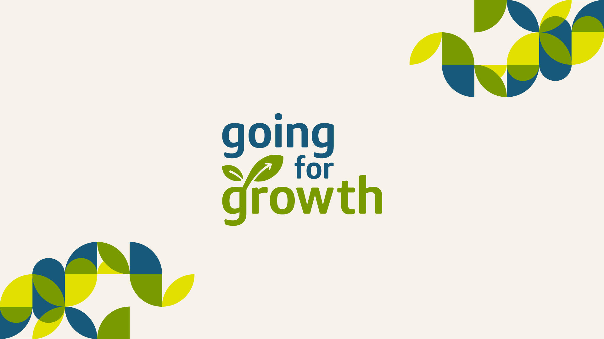
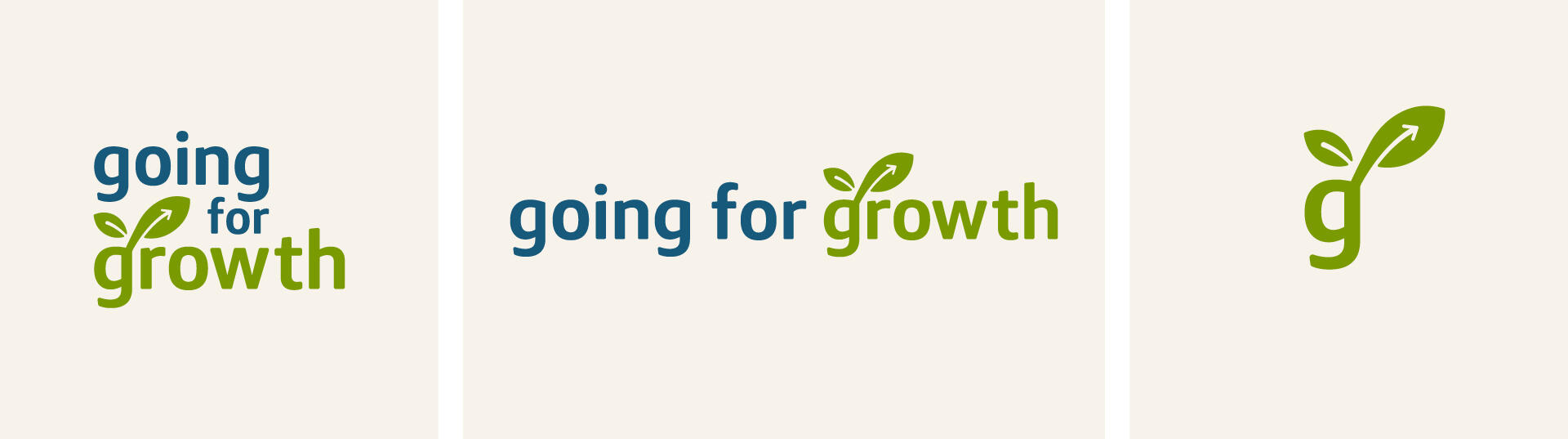
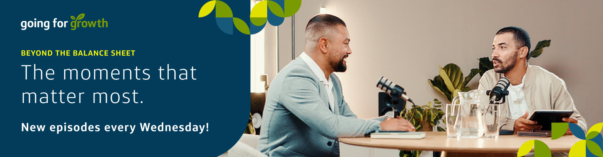
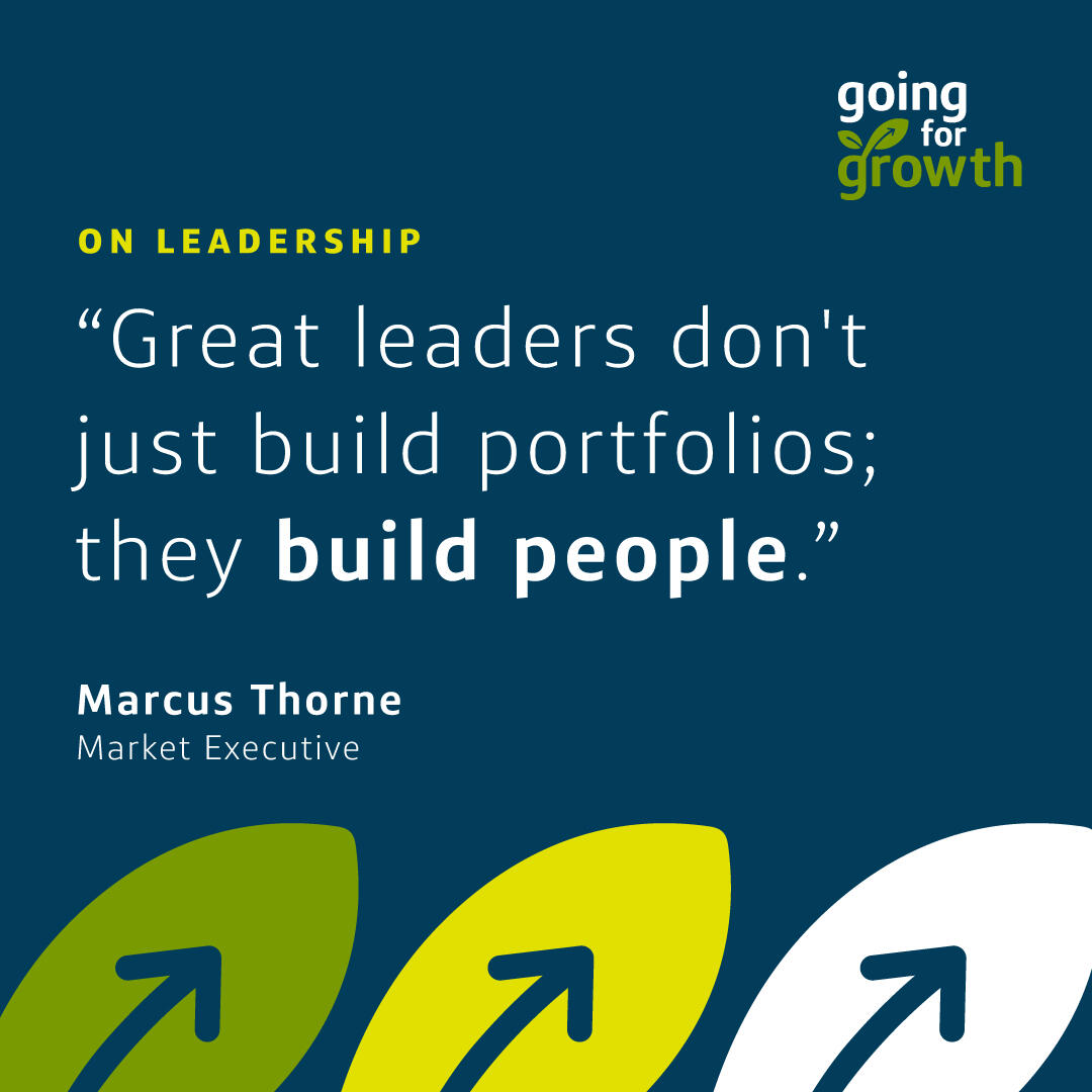
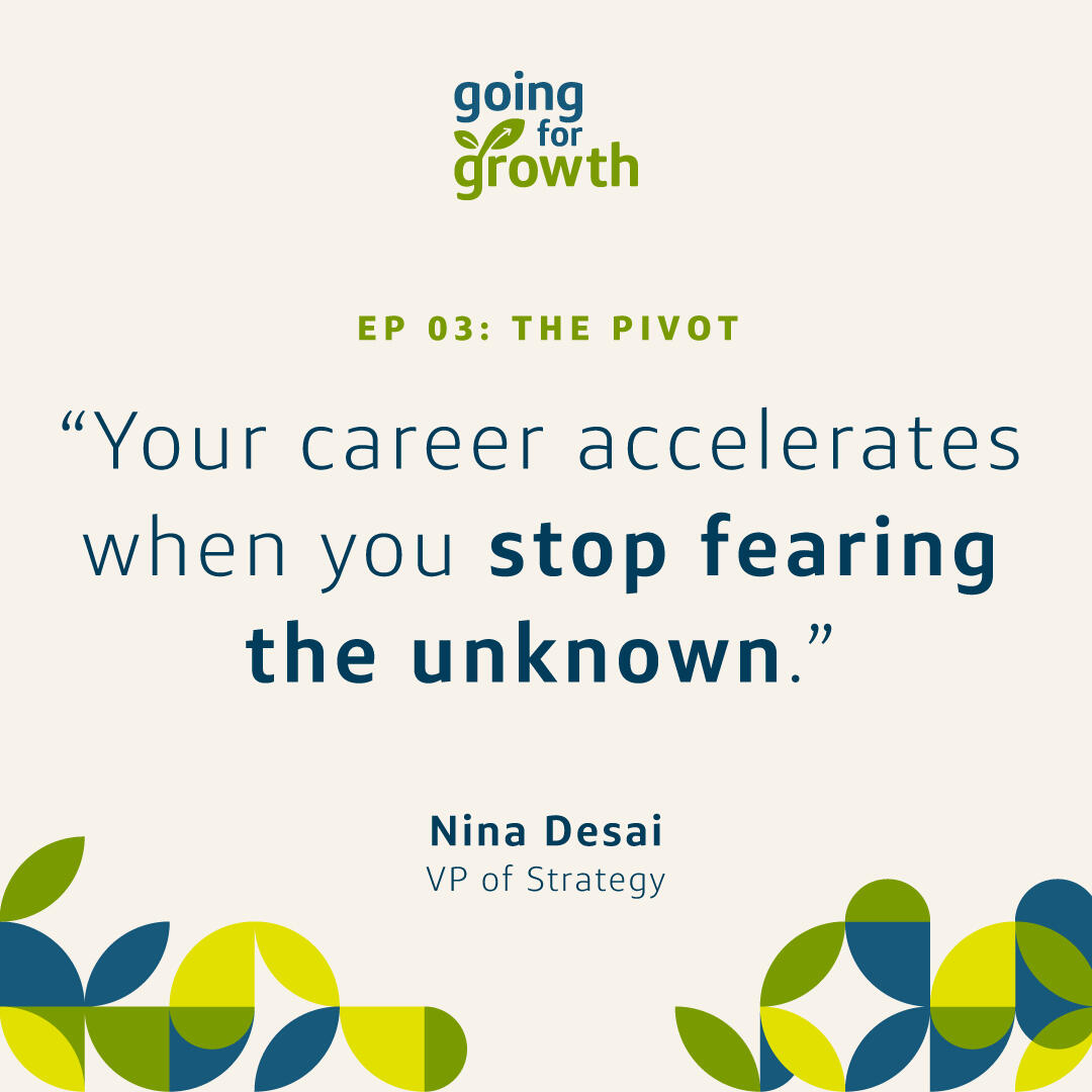
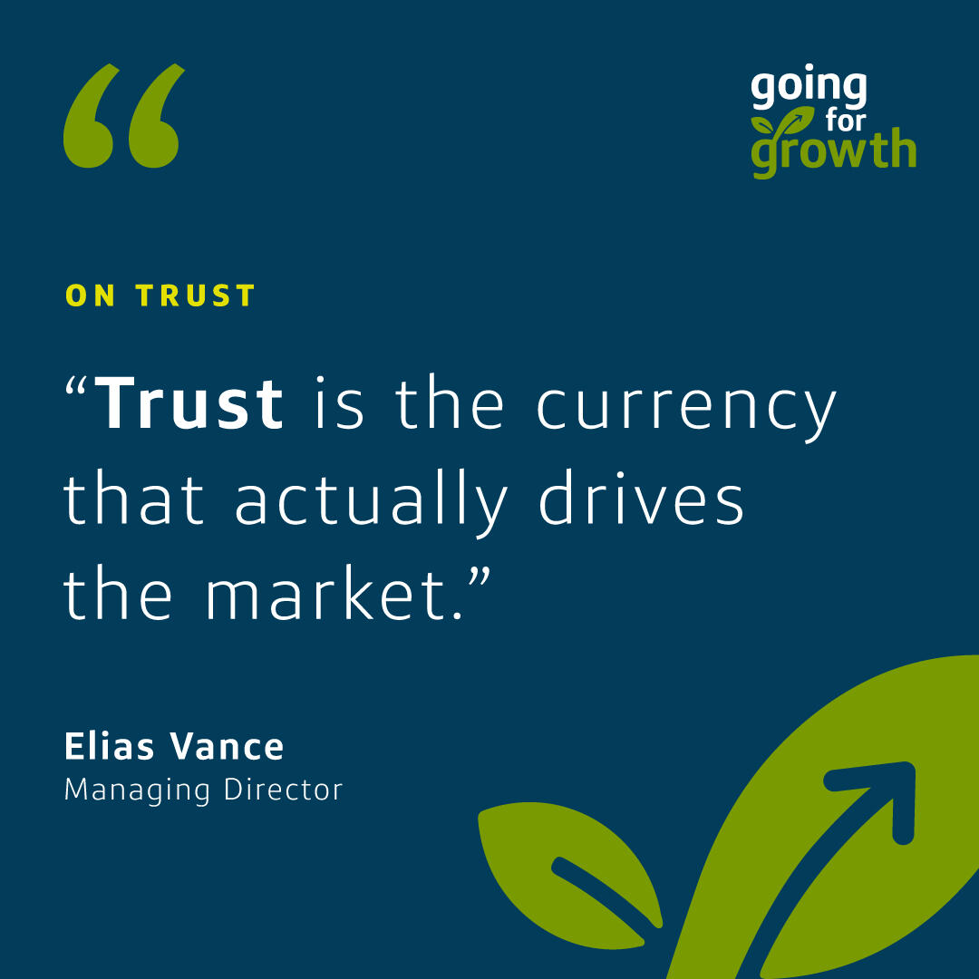
Following collaborative reviews, the team gravitated toward the leaf and upward arrow concept for its perfect balance of business momentum and personal warmth. From there, I developed a comprehensive visual system—establishing an inviting color palette and cohesive design elements that scale seamlessly across all podcast touchpoints and promotional deliverables.Deliverables included: Podcast cover art, digital banners, quote cards, iconography set, posters/promotional graphics.

Project Impact
The final brand identity was met with enthusiastic approval from key stakeholders.
I wrapped my involvement by packaging a complete suite of launch-ready assets and design guidelines, leaving the internal team fully equipped to bring the podcast to life.
View more projects

Campaign Graphics
Associate Appreciation
A look and feel, for a new initiative, to be applied across all digital communications and printed materials.
UX/UI & VISUAL DESIGN
MVP Concept App
An end-to-end app concept designed to help users document their family history in a more fun, organized, and approachable way.

PLATFORMS
Multi-channel (Internal website, event branding, emails, social posts, print materials, etc.)
Role
Graphic Designer
Project Overview
What is the Holiday Gift Campaign?
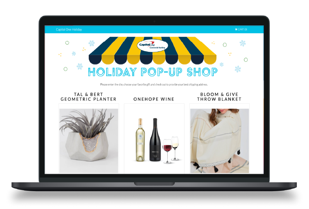
I was tasked to design a key visual and a cohesive suite of assets to be used for an associate appreciation initiative—an online shop for associates to select free gifts. My objective was to create something festive, fun, and celebratory.I wanted each associate to feel excitement from the communications and joy when they finally received their gifts.

IDEATE
Supporting the communication strategy with effective visuals
Building excitement
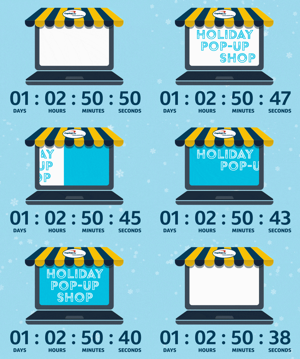
The team had several communications planned to affirm associate appreciation during the holiday season through teaser emails and social posts. Below are 2 animated gifs I created in After Effects.

Printed notecard
Receiving holiday greeting cards always makes for a festive experience. The card was used to express the leaders' appreciation to all of their associates, and included information on how to access the online shop.


Results
Holiday cheer for all associates
The campaign was successful in building conversations and excitement about the pop-up shop, and many items quickly ran out of stock on the first day it launched.
View more projects
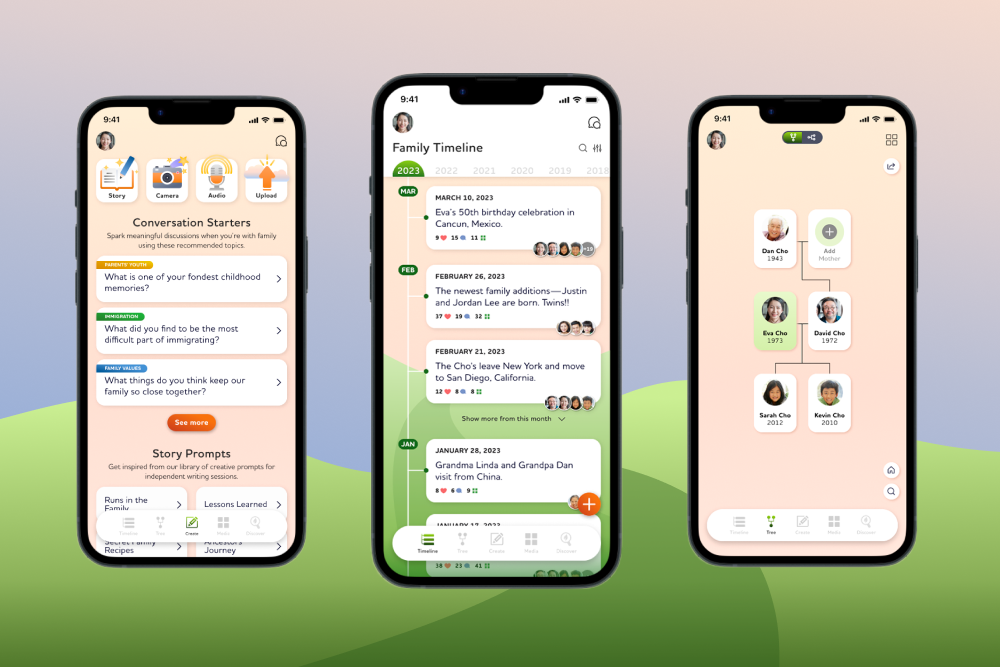
UX/UI & VISUAL DESIGN
MVP Concept App
An end-to-end app concept designed to help users document their family history in a more fun, organized, and approachable way.
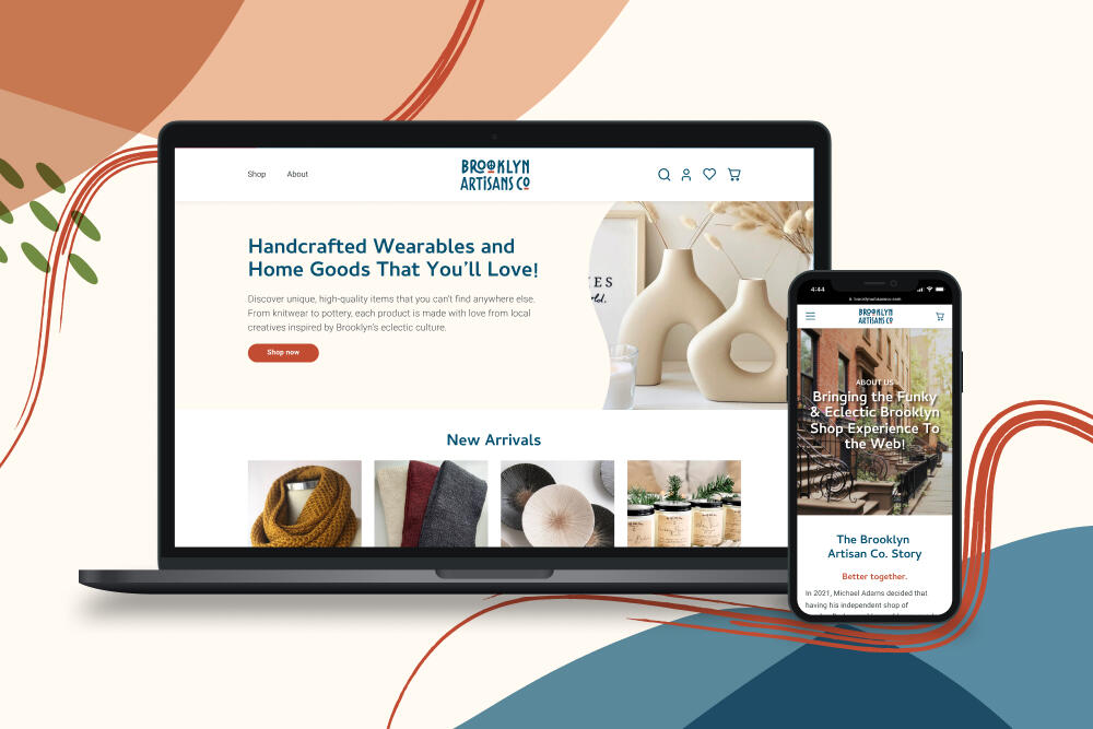
UX/UI & VISUAL DESIGN
Responsive Website
A responsive e-commerce website created for a Brooklyn-based small business that is ready to expand their online presence beyond an Etsy store.
PLATFORMS
Mobile
Role
Solo Product Designer: Research, UX/UI, Visual Design, Usability Testing
Tools
Figma, Adobe Creative Suite
Timeframe
4 Weeks
Project Overview
What is the Memory Lane App?
It is a family-focused digital tool that helps anyone stay motivated, organized, and worry-free when documenting their family history. Capture and share meaningful memories, major milestones, and unforgettable stories all in one place!Family history is not just about the past, but it is also about the present and future. Memory Lane can help users understand their family history, ultimately enabling them to create deeper, more meaningful connections.
The Challenge
How can we create an ecosystem for users to turn to when they are feeling lost, alone, or disconnected?
Problem
During the span of the pandemic, everyone around the globe realized that personal and emotional human connections are precious and almost essential - especially from family. Are there tools to help create, maintain, or strengthen family bonds?
Goal
Discover how documenting family histories can benefit individuals' emotional well-being; and create an MVP that assists users on their journey to documenting such rich and complex histories—making the process more approachable and fun!
THE RESEARCH
Understanding user needs when it comes to storytelling and building connections with family members
User Interviews
After interviewing five participants, it can be assumed that those keen on documenting their family history find the overall process overwhelming and complex. Although most of the time when they engage in conversations about the past happens organically, they are motivated to take the necessary steps to be more proactive.

Key Pain Point 1
Existing tools and methods are time-consuming, scattered, and can be disruptive to a conversation / experience

Key Pain Point 2
All participants struggle to initiate conversations with family members—they don’t know where to start and feel unprepared

Key Pain Point 3
All participants believe that the effort is intimidating to do alone, and there must be a collaborative effort to recording their family stories in one secure location
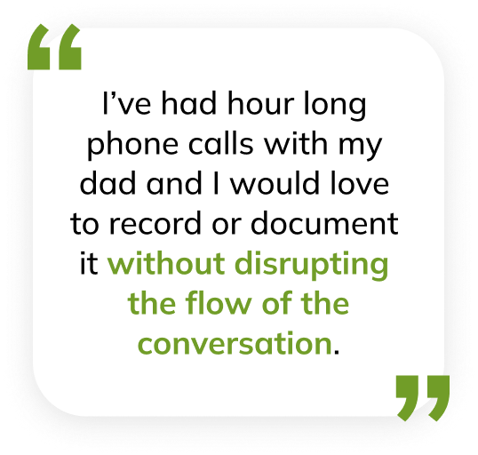
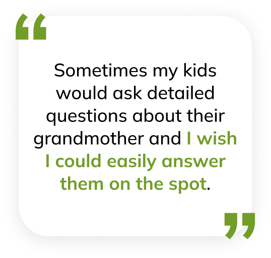

Key Findings
All participants expressed that usually their parents or older family members initiate conversations about their lineage
All participants expressed a need for a tool to facilitate conversations, especially starting them
All participants have a collection of physical materials that are referenced or passed down (family photo albums, crests, etc.)
Persona Development
After analyzing the interview results and determining the key findings, I created the following personas of users who have the motivation to document their family history—they just are missing the right tool to help them out.


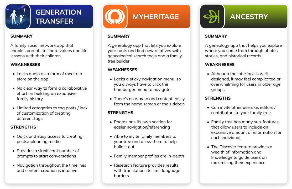
Competitive Analysis
I assessed family-focused apps with features that would benefit users in the process of documenting family stories. My objectives were:
Study common design patterns for creation, storage, and organization of user-generated content.
Discover unique features related to timelines and family trees.
Storyboards
In addition to personas, I visualized two storylines in which Memory Lane would come in handy. I used this as reference points throughout the project to ensure that I was designing for the target range of needsThe tool can be designed to help the user in a variety of situations—providing positive experiences for the individual or their whole family.


People with a desire to document their family history for themselves and future generations find the overall process overwhelming. The core of their current frustrations is starting conversations and keeping everything organized. We need to build a tool for them to utilize in the moment or enable them to be proactive.
DEFINE & IDEATE
Constructing the app architecture
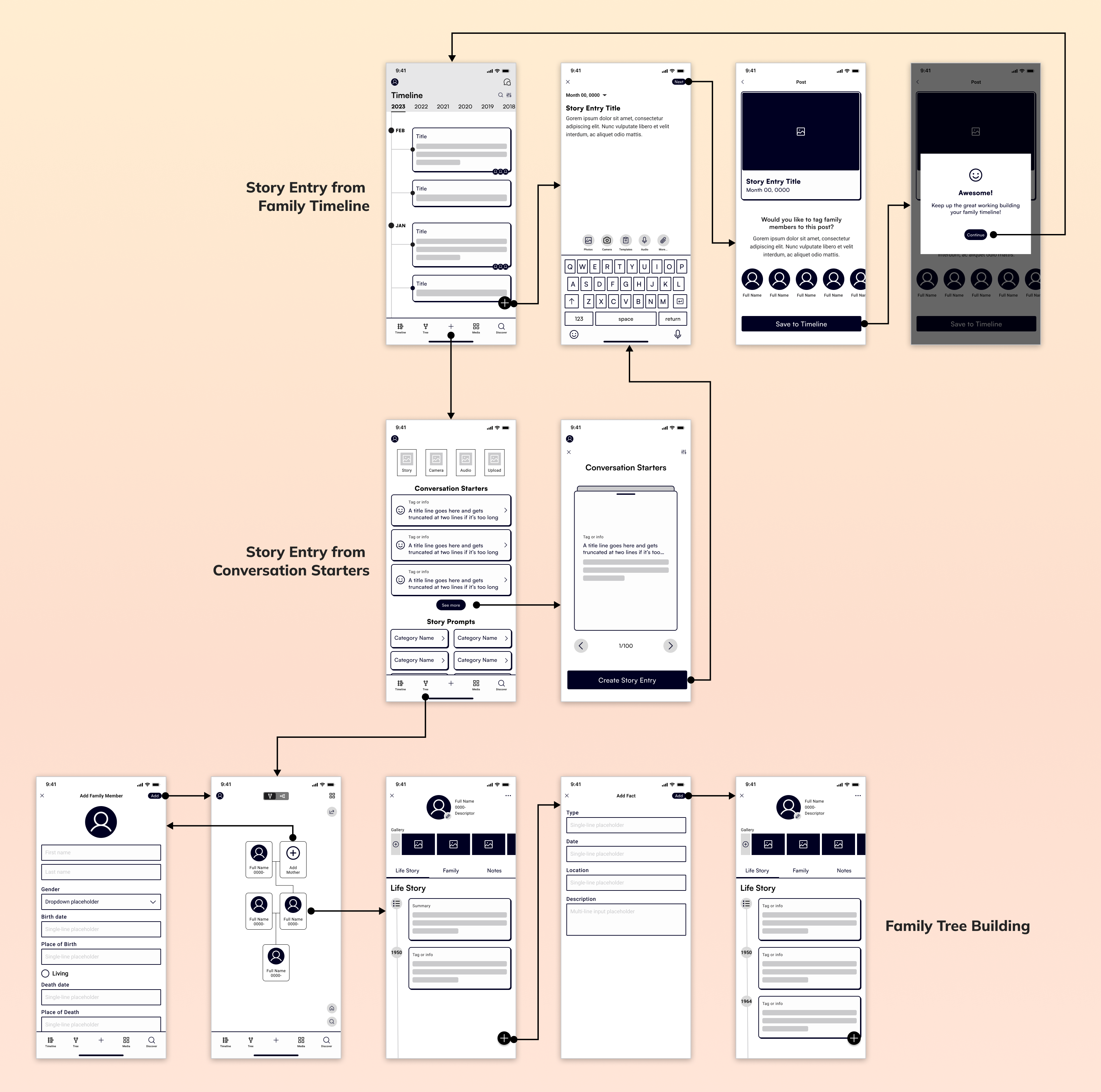
With the personas’ frustrations and goals in mind, I ideated several features that users would expect from a family history documentation app. Below is a wireflow detailing how the user would navigate between each main feature.
Visualizing potential solutions to give users confidence to be proactive
3 main user tasks
Review Family Timeline and add a new story entry
Review Conversation Starters as an alternative way to create story entries
Review Family Tree feature
PROTOTYPE
Key Solutions

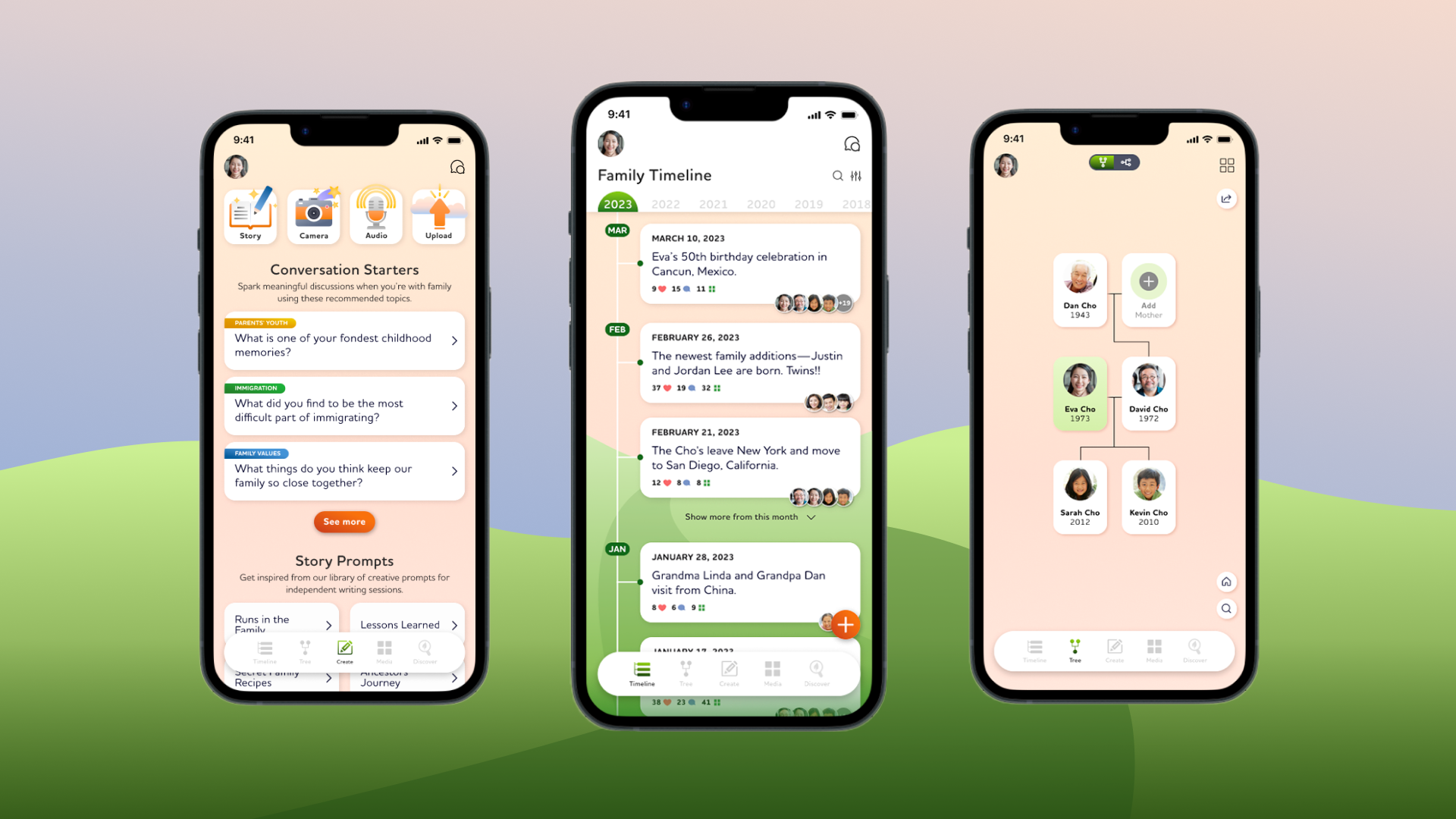
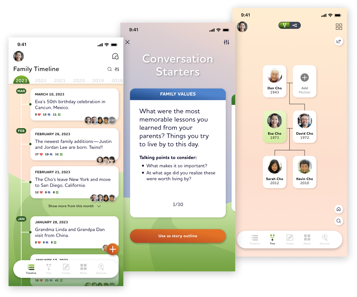
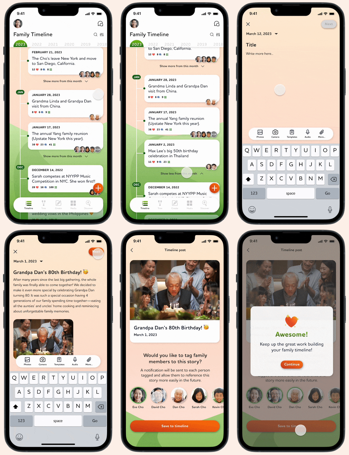
Detailed Family Timeline with intuitive navigation to creating and documenting stories
The Timeline feature was designed to provide the most important information at a quick glance. If users wanted to dive deeper, they could easily do so.
Tagging family members with profiles
Each story entry can be tagged with family members relevant to that story. They would receive notifications upon confirmation. This tagging system supports an important filtering / sorting option for the Timeline. It also promotes an engaging, collaborative environment.
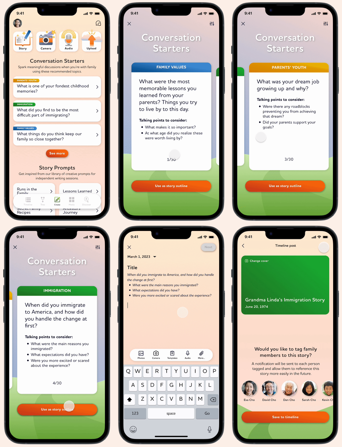

Providing conversation starters with familiar swiping gestures
Utilizing this universal design pattern allows for easy and digestible scanning through many content cards.Categories: The cards are color-coded by the type of conversation topicPre-populated Story Entries: Each conversation starter comes with suggested talking points that are then pre-populated into the writing field for the story

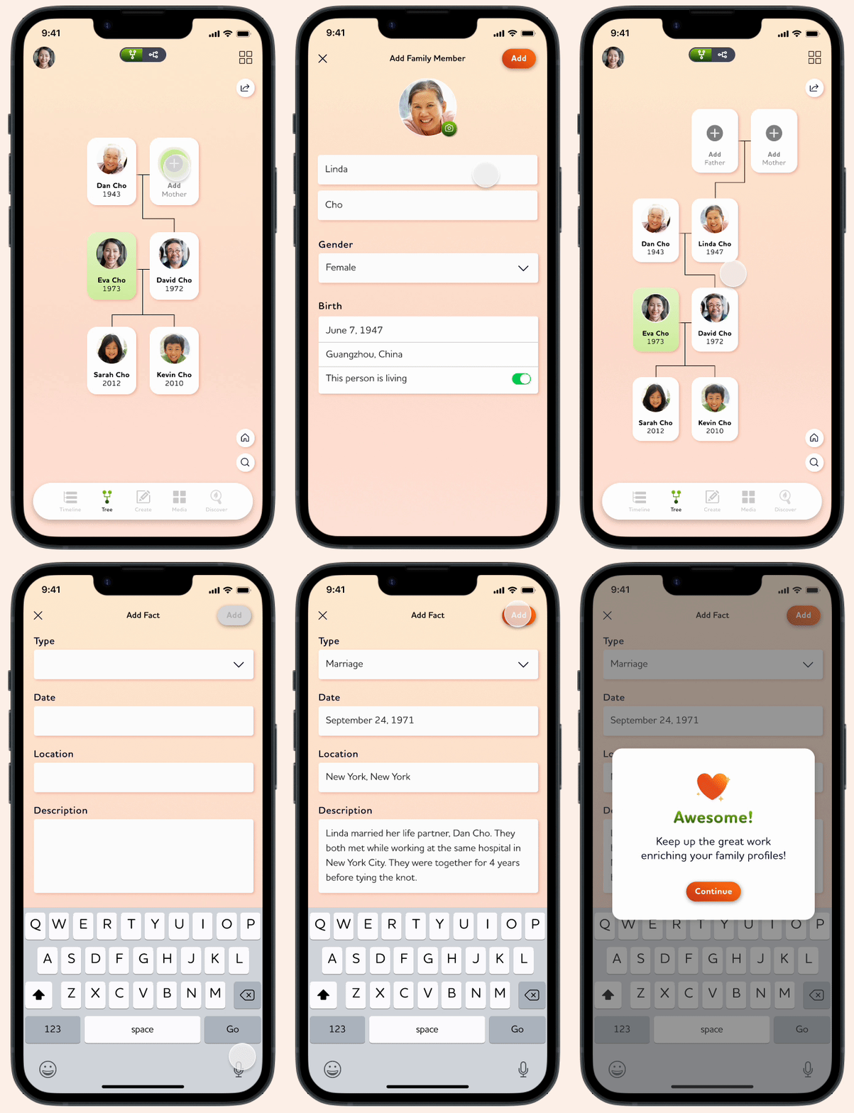
Intuitive Family Tree builder with rich member profiles
Providing a standard family tree chart with intuitive functionality makes it an approachable task that users want to keep returning to.Additional family member facts: Separate from the Family Timeline, these additional facts can give users a more focused lens on learning more about specific family members.
USABILITY TESTING
Testing to find new insights or frustrations
Clearing confusion with more direct language and iconography
Some participants didn't know what to expect when hitting the "View more" button on the timeline. I changed the copy to be more direct.There was also confusion on the difference between the plus icon on the main screen vs. the one in the navigation bar. I changed the icon in the navigation bar to help differentiate it from similar buttons.

User guidance for different functions
Most participants questioned the difference between Conversation Starters and Story Prompts. I added brief descriptions to help guide users to the appropriate experience.

Improving placement and color-contrast of main action buttons & text hierarchy
Some participants showed hesitation on screens where the action buttons were too close to the bottom or against darker backgroundsThe Conversation Starters needed better text hierarchy for easier scanning.

VALIDATION AND NEW INSIGHTS
After usability testing, key features proved to be very successful
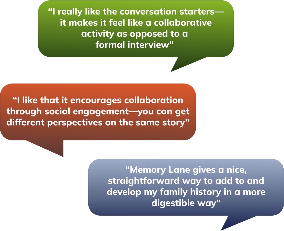
The conversation starters received excellent feedback and addresses 2 major pain points
All participants conveyed that the conciseness of using the conversation starter cards would be beneficial for their needs—iniating conversations and having a collaborative experience.
DESIGN IDENTITY AND STYLE GUIDE
A heartwarming environment for heartwarming memories
Memory Lane is a helpful tool in a user’s journey to documenting their family history. The branding needs to create a warm, welcoming place where people feel empowered to create, store, and enrichen memorable stories.

FINAL THOUGHTS
Major takeaways and next steps
Use the power of familiarity in design
Altering or avoiding familiar gestures and actions can easily disrupt a user’s experience. It’s better to include these gestures at first until testing proves them to be detrimental.
Limited prototype functionality shouldn’t limit test results
The simple question of “What did you expect to happen when you interacted with that element?” is both powerful and effective when conducting usability testing.
Potential next steps
I would continue building out the other parts of the app:
Conduct a 2nd round of usability testing for the changes made
Design and test the Discover Feature according to user needs revealed through my research
View more projects
UX/UI & VISUAL DESIGN
Responsive Website
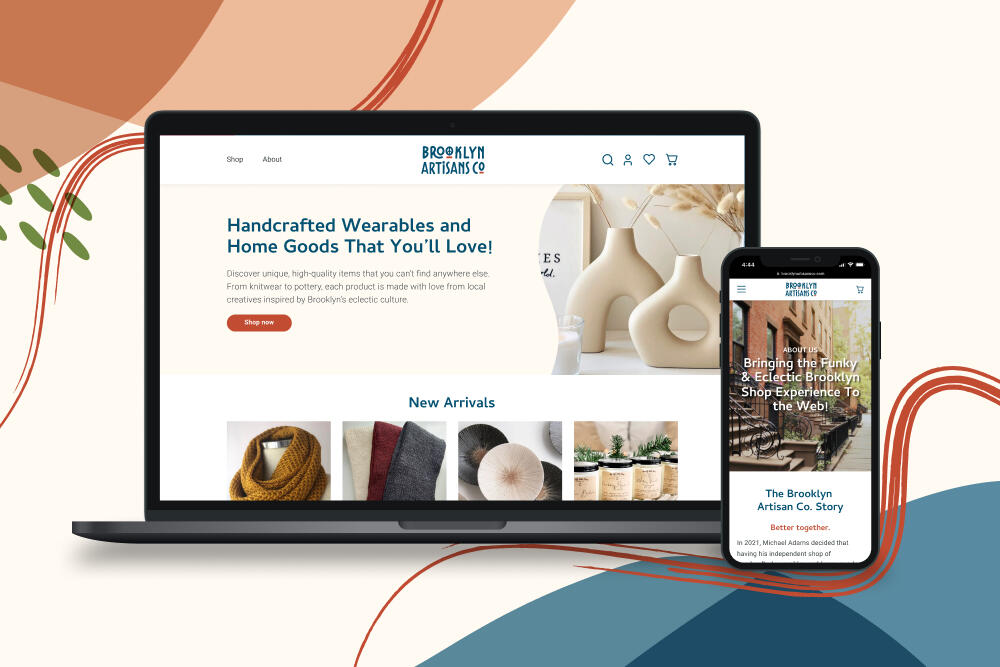
A responsive e-commerce website created for a Brooklyn-based small business that is ready to expand their online presence beyond an Etsy store.
Brand identity
Volunteer Program
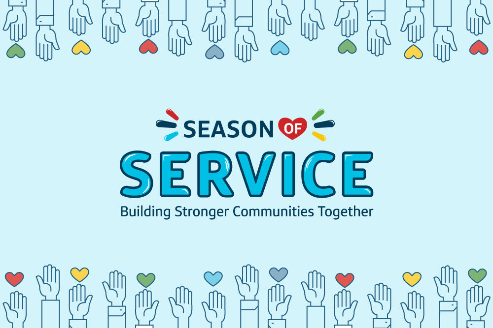
A logo and brand identity design for a new internal community service initiative.
PLATFORMS
Responsive Website
Role
Solo Product Designer: Research, UX/UI, Visual Design, Usability Testing
Tools
Figma, Adobe Creative Suite, Maze
Timeframe
4 Weeks
Project Overview
What is Brooklyn Artisans Co.?
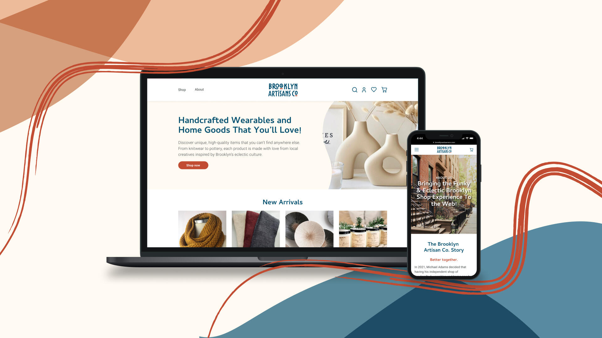
Brooklyn Artisans Co. (BAC) is a collection of local crafters and DIY-ers selling their creations under one shop—bringing joy to those who seek unique or handmade goods. The store has been selling on Etsy for over a year, accumulating a significant amount of sales and customer reviews. Their short-term goal is to build an independent website as the store becomes more established with more artisans and product offerings.The store owner approached me to design a responsive website so that when they are ready to transition away from Etsy, they will have a strong blueprint to follow.
The Challenge
How can BAC create its own space where it can't be overshadowed by competition just a click away?
Problem
Existing in competitive marketplaces like Etsy can be difficult to establish a business as a full-fledged shop. It can also force customers to be overwhelmed by the oversaturation of similar handmade products being sold.
Goal
Establish a unique online presence different from their Etsy profile—somewhere their artisans will be proud to sell their goods, as well as share their stories.
THE RESEARCH
Understanding how our target customers prefer to shop, what they value most, and determine if where they shop matters
User Interviews
After interviewing several participants, it can be assumed that shopping for handmade or unique items are generally ubiquitous across several types of customers. All participants frequently visit Etsy and strongly emphasized the same frustrations despite their personal needs.

Key Pain Point 1
It has become difficult to differentiate which stores are actually small businesses of handmade products and not resellers of mass-produced items.
Key Pain Point 2
The shopping experience can get overwhelming because of the extensive amount of products to look through.
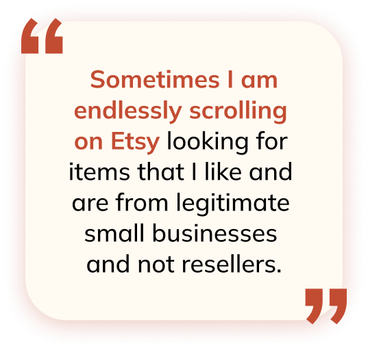
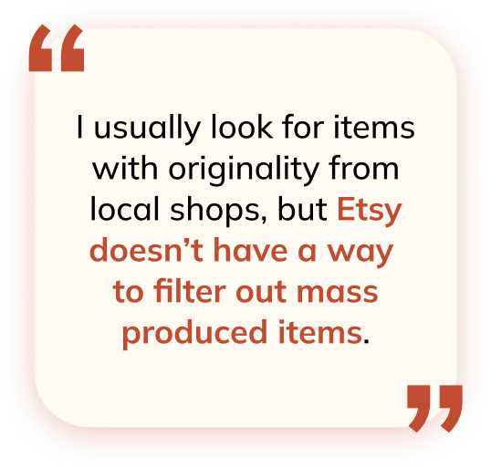
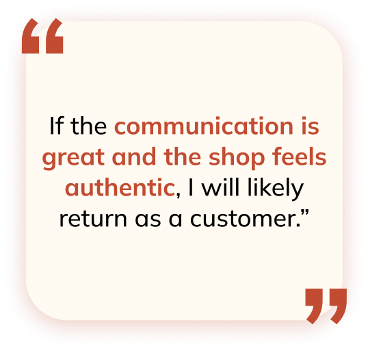
Key Findings
All participants value uniqueness, good quality, supporting small businesses, and customer reviews
Participants expressed that learning about artisans’ stories give them more confidence in their purchases, and makes them feel more emotionally connected
Participants seek honest transactions—trust in sellers builds confidence in purchases
Persona Development
After analyzing the interview results and determining the key findings, I created the following personas that encapsulate the spectrum of customers who enjoy shopping for unique or handmade goods.


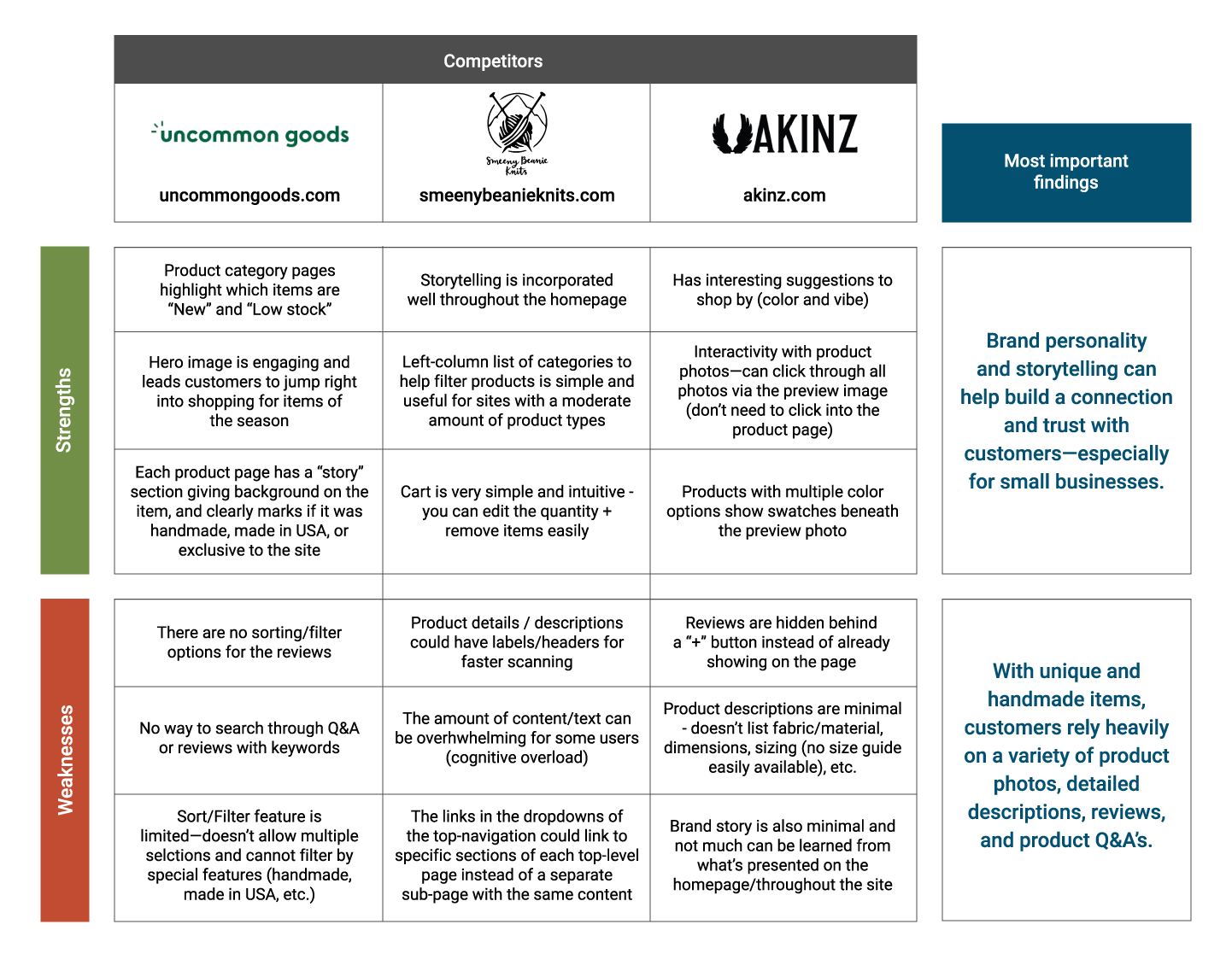
Competitive Analysis
I focused on assessing online stores that sell unique and handmade goods. My objectives were:
Determine the success factors for small businesses to thrive independently from marketplaces
Discover methods for storytelling and building customer confidence in the products
Storyboards
In addition to personas, I visualized the present and future states of the customer experience through storyboards. Having these assets to reference throughout the design process helped keep intentions and design priorities on track.Present State: The customer gets frustrated with spending hours on marketplaces only to buy a product that didn't meet her expectationsFuture State: The customer can easily build trust with the shop, giving them more confidence in their purchase.


Although where customers shop plays a role in there shopping experience, the core of their current frustrations is a lack of trust. We need to design an online experience that tells stories, bridges connections, and celebrates the quality and care customers desire.
DEFINE
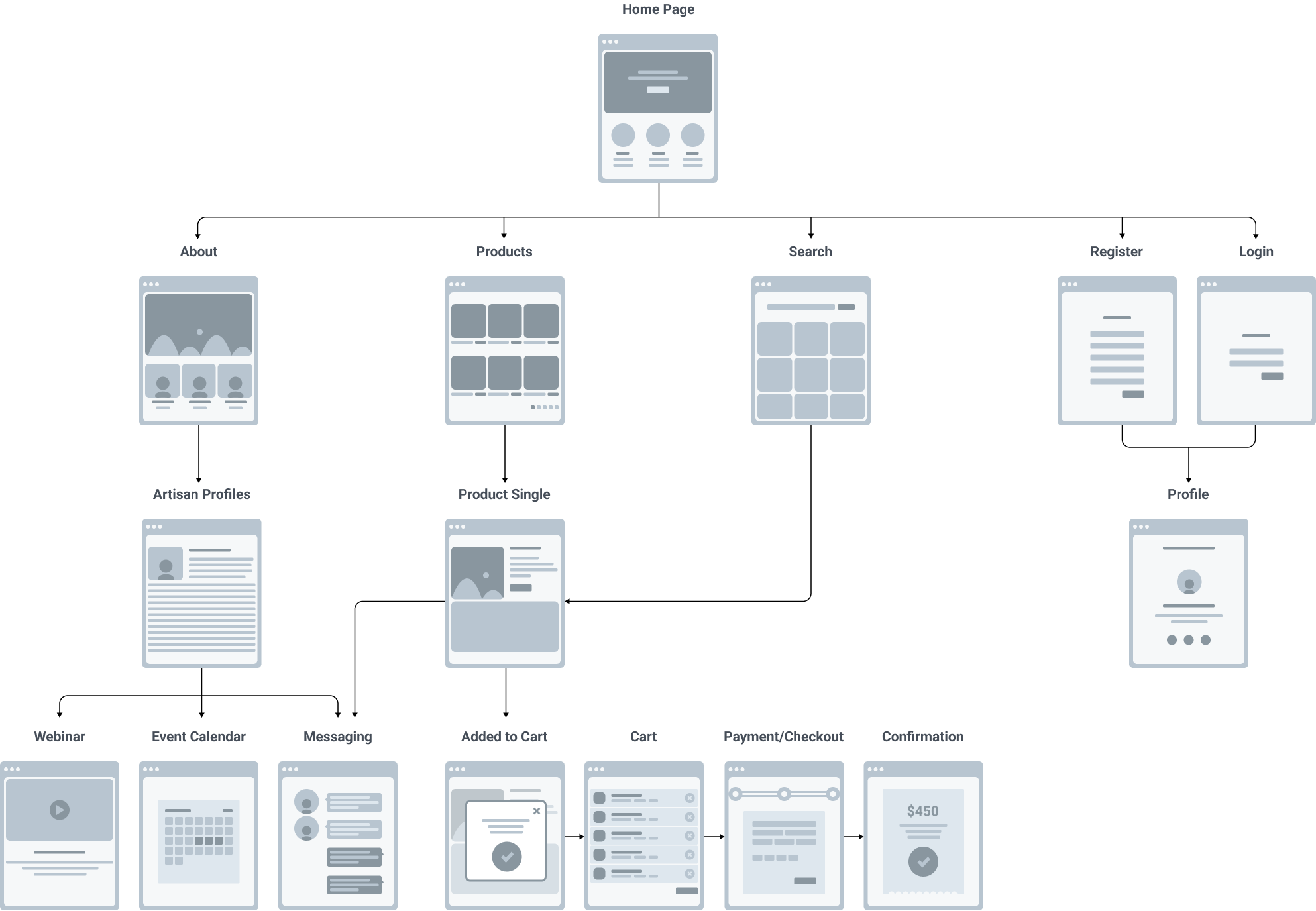
Constructing the app architecture
With the persona's frustrations and goals in mind, I anticipated user expectations and how they would navigate the BAC website using a flowchart. Users are able to easily flow through the interface in ways that benefit their immediate shopping needs. The pages created to address the lack of trust are easily accessible and are meant to enhance the overall shopping experience.
IDEATE
Visualizing potential solutions to boost customer trust and confidence
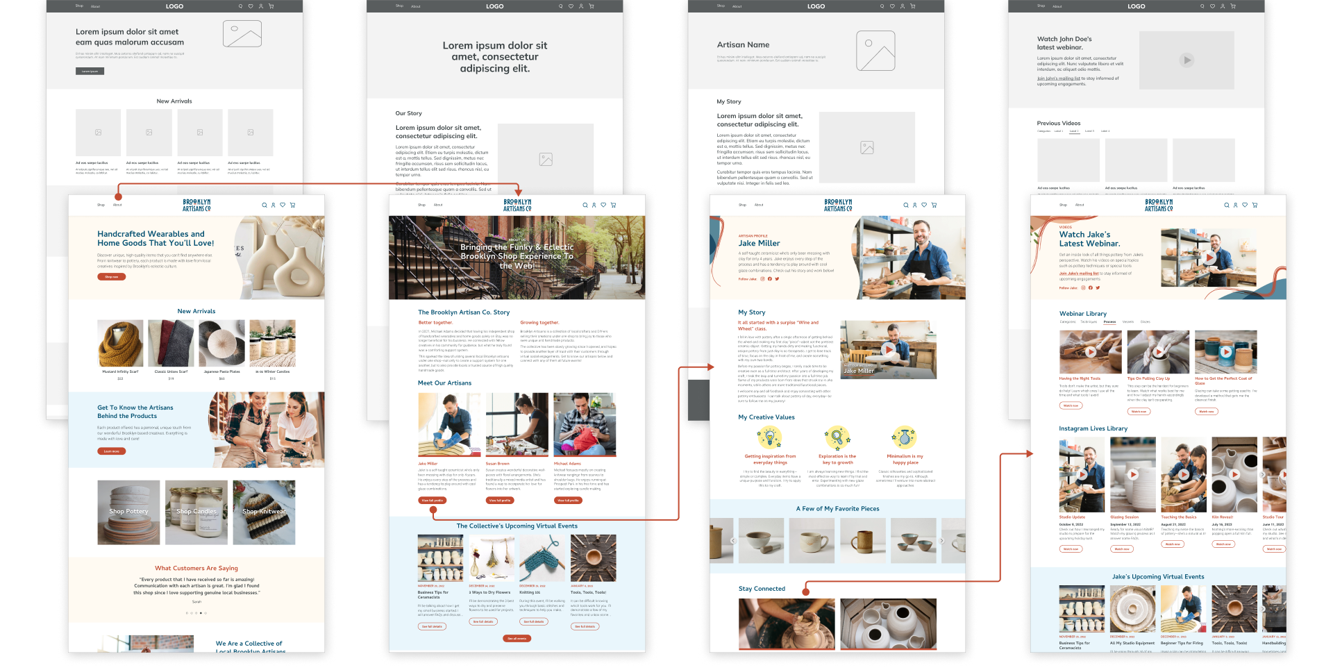
Wireframes
While constructing the website's architecture, I focused on giving users opportunities to explore via multiple touchpoints on each page. They can easily learn more about the store, the artisans, and the craft behind each category of products.
PROTOTYPE
Key Solutions

Providing in-depth background information about each artisan
When it comes to purchasing unique goods, there is always a story to be told behind the product. My research has shown that most customers benefit from learning more about sellers. Each artisan profile gives customers full access to learn as much as they want.
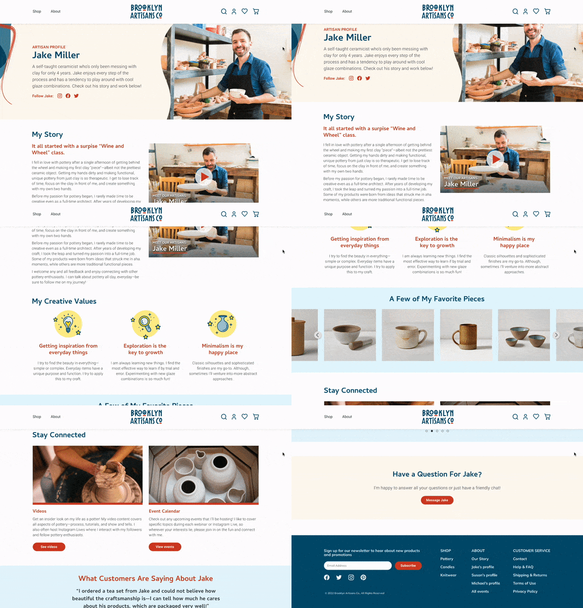
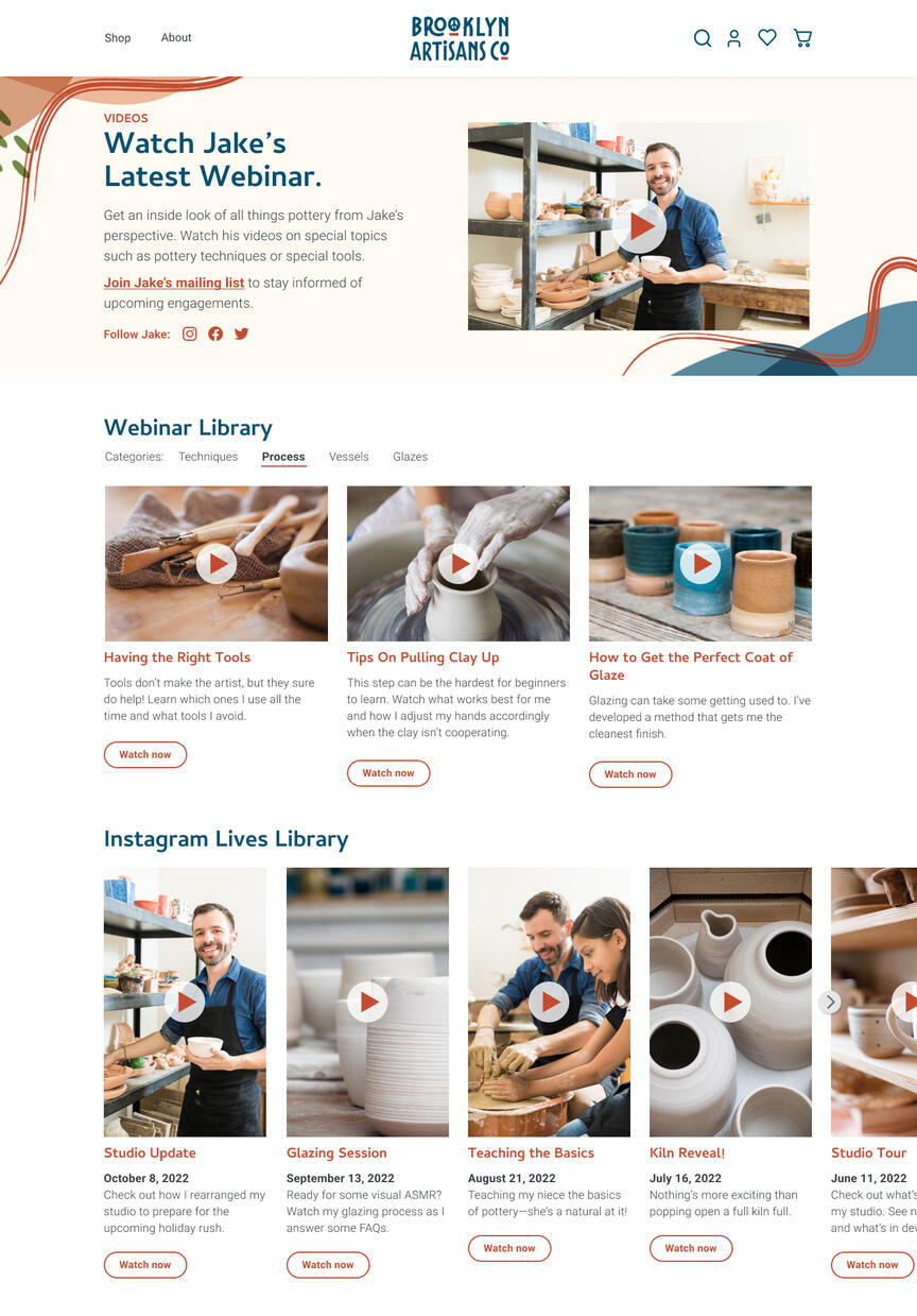

Showcasing a wealth of video content that gives users an "inside look"
Being a small business owner these days often requires creating content that emotionally connects them with their customers. Giving the artisans a platform to store their content, allows them to provide customers with a more premium shopping experience.Webinar Library: A collection of educational videos that covers the breadth of the artistry and craftsmanship of handmade goods.Instagram Lives Library: An archive of social media engagements giving a peek into the artisans' more personal, "fun" side of the business.

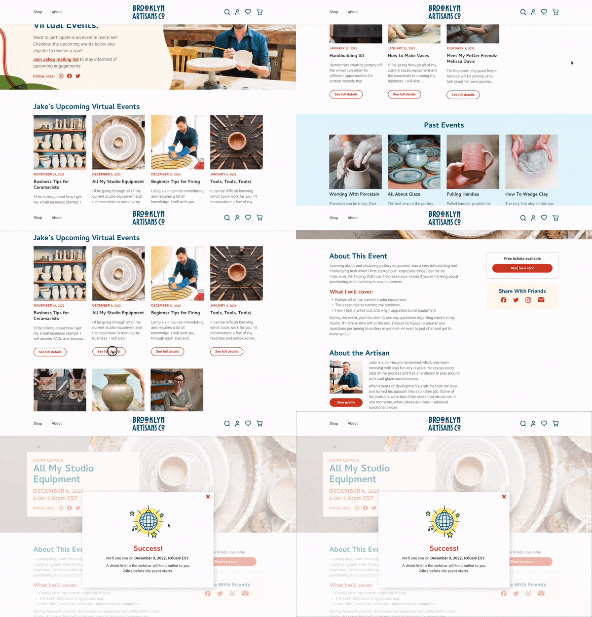
Creating an intuitive and informative event registration flow
The key to successful event registration and engagement is ensuring attendees are well-informed about the event and able to quickly sign up.
USABILITY TESTING
Testing to find new insights or frustrations
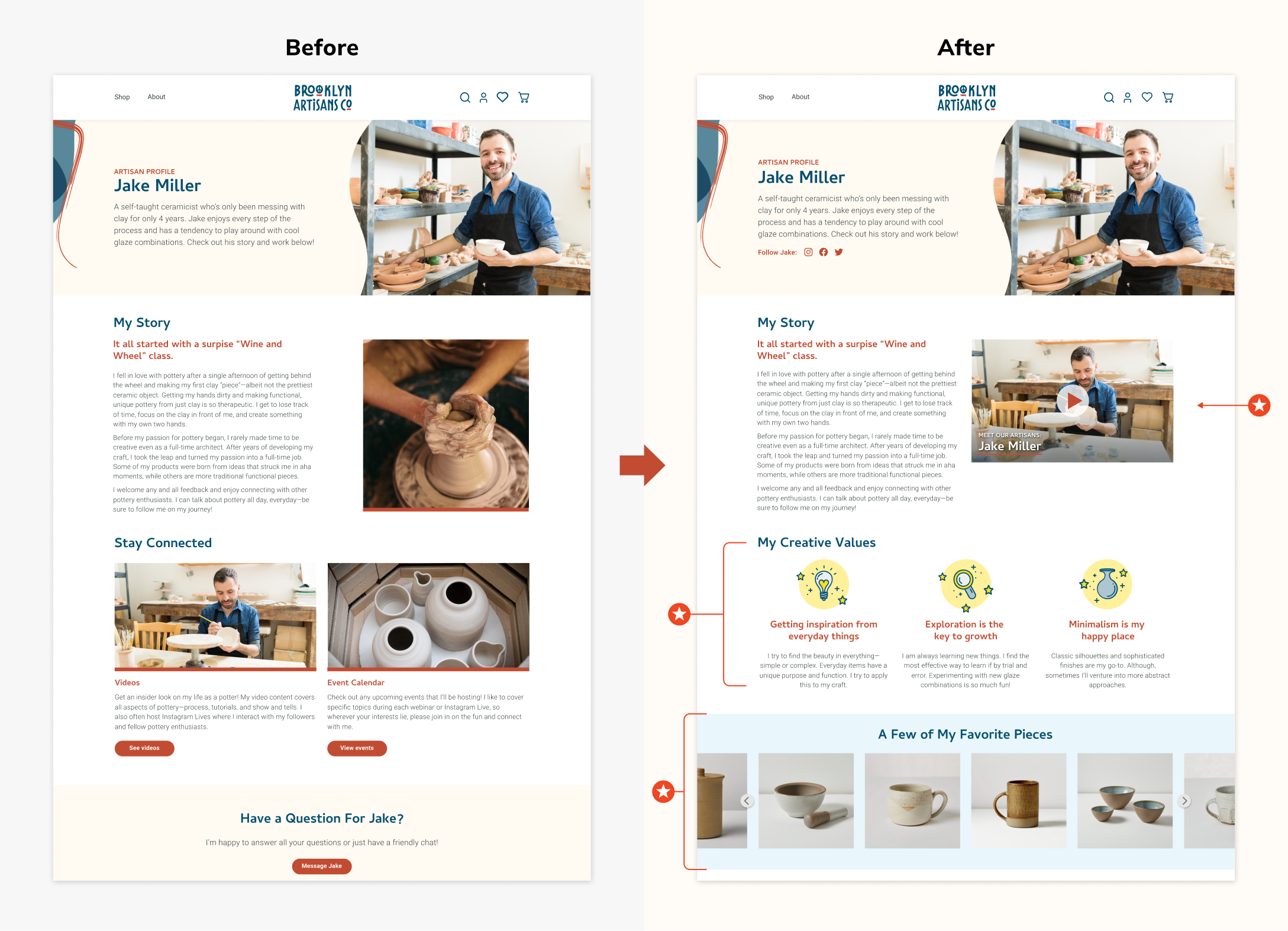
Showing even more personality
Participants expressed even more interest in learning about the artisans, so I added sections that highlight their creative values and favorite art pieces.
Variations in types of content
Although participants liked having artisan background information to read, they expressed a preference to watching a video as an alternative to learning more about the artisan.
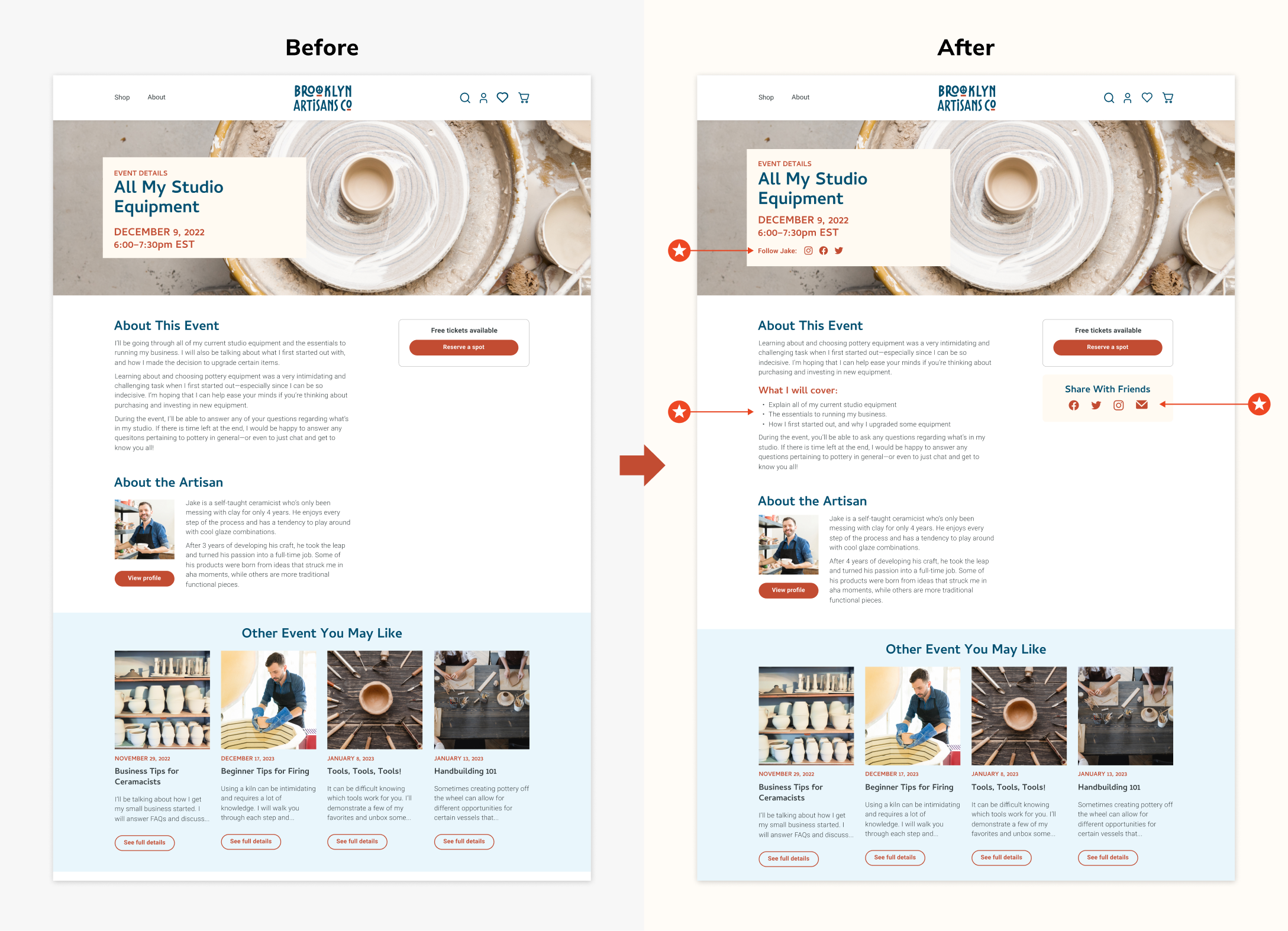
More touch points to access social media profiles
Test participants wondered where to access the artisans' social media profiles. I added links on each artisan-specific page, and created a share feature for the events.
Making event details more scannable
Some participants felt that the text blocks for the event details were bulky, so I broke it down into bullets and made the information easier to scan.
VALIDATION AND NEW INSIGHTS
After testing high-fidelity prototypes, key areas of focus had positive feedback with minimal changes
The design, branding, and content of the website created a warm, welcoming environment
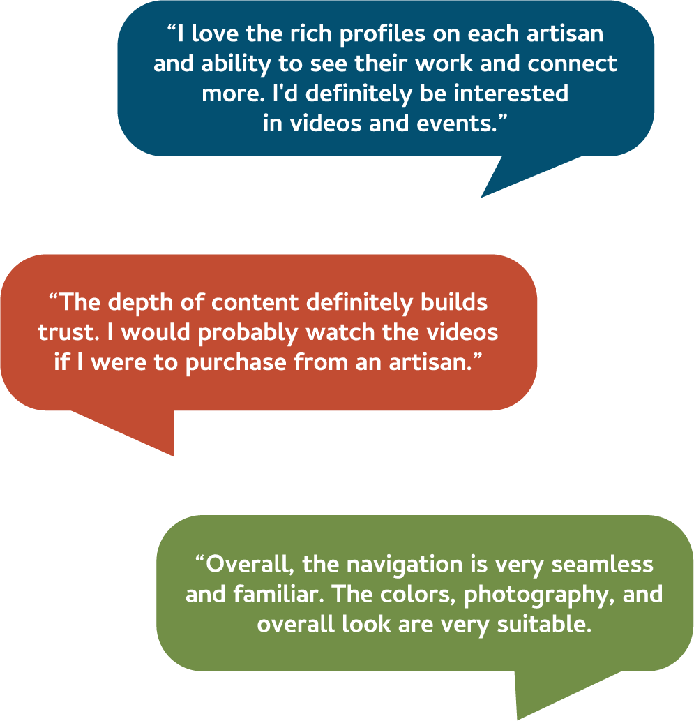
Test participants expressed delight when navigating throughout the prototypes—exploring with confidence and ease. The main flow of navigating from the homepage to event registration had a 100% success rate.
The video library and event engagement offerings boosted customer confidence
All participants conveyed that these opportunities to learn and connect with artisans would encourage them to frequently return to the website.
DESIGN IDENTITY AND STYLE GUIDE
Redesigned identity: Hand-drawn meets funky modern
I was tasked to redesign the existing logo and brand identity to reflect the store's growth as a fun Brooklyn-based company with edge. I took inspiration from the Brooklyn brownstone neighborhoods and general NYC landscape, while utilizing organic and flowing elements.

FINAL THOUGHTS
Major takeaways and next steps
Utilize defined task flow or flowcharts as a project's North Star
Remaining on track is vital to progressing a project in a timely manner. It can be easy to get lost designing screens that may not be used for testing. Looking back at a defined flowchart can help prioritize what needs to be done.
Users prefer more information, but in bite-size chunks
In places where I felt more information was better, my test participants conveyed interest in having the information be presented in a different format (e.g. instead of just a 4-paragraph long description, include a video to watch as an alternative to learning more).
Potential next steps
I would continue building out the other parts of the website:
Focus on the task flow of purchasing items—how can we maintain a level of customer confidence and trust throughout?
Test how existing task flows can be integrated when customers are making purchases
View more projects
BRAND IDENTITY
Volunteer Program
A logo and brand identity design for a new internal community service initiative.
BRAND IDENTITY
Awards Program
A refreshed identity for an associate awards program that provides a premium experience.